In addition to the membership and role management
APIs, ASP.NET from version 2.0 onward offers several server controls
that make programming security-related aspects of a Web application
easier than ever: Login, LoginName, LoginStatus, LoginView, PasswordRecovery, ChangePassword, and CreateUserWizard.
These are composite controls, and they provide a rich, customizable
user interface. They encapsulate a large part of the boilerplate code
and markup you would otherwise have to write repeatedly for each Web
application you developed. Figure 1 offers a comprehensive view of the membership platform and illustrates the role of the login controls.
The Login Control
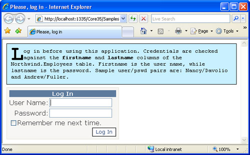
An
application based on the Forms authentication model always needs a
login page. Aside from the quality of the graphics, all login pages
look alike. They contain a couple of text boxes (for username and
password), a button to validate credentials, plus perhaps a Remember Me
check box, and possibly links to click if the user has forgotten his or
her password or needs to create a new account. The Login control provides all this for free, including the ability to validate the user against the default membership provider.
Setting Up the Login Control
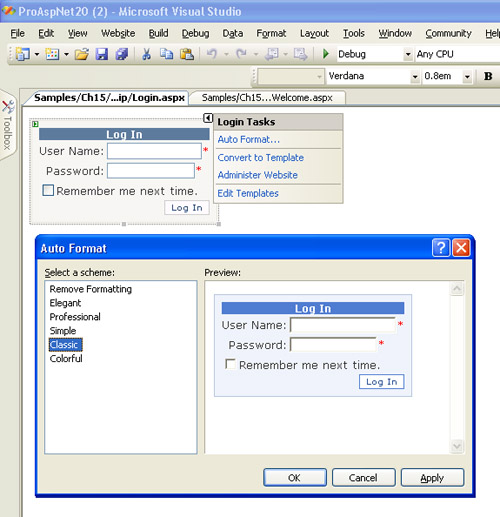
The Login control is a composite control that provides all the common user interface elements of a login form. Figure 2
shows the default user interface of the control. To use it, you simply
drop the control from the toolbox onto the Web form, or you just type
the following code:
<asp:login runat="server" id="MyLoginForm" />
The Login
control also has optional user-interface elements for functions such as
password reminder, new user registration, help link, error messages,
and a custom action in case of a successful login. When you drop the
control onto a Visual Studio 2008 form, the AutoFormat verb lets you
choose among a few predefined styles, as in Figure 3.
The
appearance of the control is fully customizable through templates and
style settings. All user-interface text messages are also customizable
through properties of the class.
The Programming Interface of the Control
The
control is modularized, and each constituent part can be individually
customized. The parts include the Username and Password text boxes, the
Submit button, the button to create a new user, the Remember Me check
box, and instructions with guidance to the user.
If you don’t like the standard user interface of the control, you can define your own template too:
<asp:login runat="server" id="MyLoginForm">
     <layouttemplate>
        ...
     </layouttemplate>
</asp:login>
Your
template can include new elements, and you can recycle default
components. To do the latter, you should use the same ID for the
controls as in the default template. To simplify this operation,
right-click on the control in the Visual Studio designer, choose
Convert To Template, and switch to the Source view. The markup you see
is the default template of the control expressed as ASP.NET code. Use
it as a starting point for creating your own template.
Events of the Control
The Login control fires the server events listed in Table 1.
Table 1. Events of the Login Control
| Event | Description |
|---|
| Authenticate | Fires when a user is authenticated. |
| LoggedIn | Fires when the user logs in to the site after a successful authentication. |
| LoggingIn | Fires
when a user submits login information but before the authentication
takes place. At this time, the operation can still be canceled. |
| LoginError | Fires when a login error is detected. |
In
most common cases, though, you don’t need to handle any of these
events, nor will you likely find it necessary to programmatically
access any of the numerous properties of the control.
The most common use for the Login
control is to use it as a single-control page to set up the user
interface of the login page for use with Forms authentication. The
control relies entirely on the membership API (and the selected
provider) to execute standard operations, such as validating
credentials, displaying error messages, and redirecting to the
originally requested page in the case of a successful login.
If you have a provider with custom capabilities that you want to be reflected by the Login control, you need to modify the layout to add new visual elements bound to a code-behind method. In the code-behind method, you invoke the custom method on the custom provider.
The LoginName Control
The LoginName
control is an extremely simple but useful server control. It works like
a sort of label control and displays the user’s name on a Web page:
<asp:loginname runat="server" />
The control captures the name of the currently logged-in user from the User intrinsic object and outputs it using the current style. Internally, the control builds a dynamic instance of a Label control, sets fonts and color accordingly, and displays the text returned by the following expression:
string name = HttpContext.Current.User.Identity.Name;
The LoginName control has a pretty slim programming interface that consists of only one property—FormatString. FormatString defines the format of the text to display. It can contain only one placeholder, as shown here:
myLogin.FormatString = "Welcome, {0}";
If Dino is the name of the current user, the code generates a “Welcome, Dino” message.
The LoginStatus Control
The LoginStatus
control indicates the state of the authentication for the current user.
Its user interface consists of a link button to log in or log out,
depending on the current user logon state. If the user is acting as an
anonymous user—that is, he or she never logged in—the control displays
a link button to invite the user to log in. Otherwise, if the user
successfully passed through the authentication layer, the control
displays the logout button.
Setting Up the LoginStatus Control
The LoginStatus control is often used in conjunction with the LoginName
control to display the name of the current user (if any), plus a button
to let the user log in or out. The style, text, and action associated
with the button changes are conveniently based on the authentication
state of the user.
The following code creates a table showing the name of the current user and a button to log in or log out:
<table width="100%" border="0"><tr>
    <td>
        <asp:loginname runat="server" FormatString="Welcome, {0}" />
    </td>
    <td align="right">
        <asp:loginstatus runat="server" LogoutText="Log off" />
    </td>
  </tr>
</table>
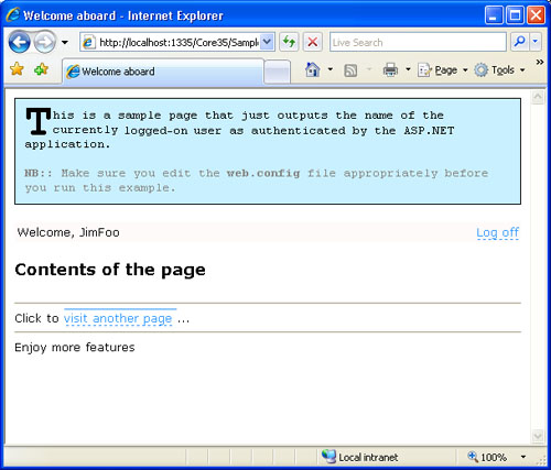
Figure 4 shows the results. The first screen shot demonstrates a page that invites a user to log in, while the second shows the LoginName and LoginStatus
controls working together in the case of a logged-in user. To detect
whether the current user is authenticated and adapt the user interface,
you can use the IsAuthenticatedUser object: property of the
void Page_Load(object sender, EventArgs e)
{
    if (User.Identity.IsAuthenticated)
       // Adjust the UI by outputting some text to a label
        Msg.Text = "Enjoy more features";
    else
        Msg.Text = "Login to enjoy more features.";
}
The Programming Interface of the Control
Although the LoginStatus
control is quite useful in its default form, it provides a bunch of
properties and events that you can use to configure it. The properties
are listed in Table 2.
Table 2. Properties of the LoginStatus Control
| Property | Description |
|---|
| LoginImageUrl | Gets or sets the URL of the image used for the login link. |
| LoginText | Gets or sets the text used for the login link. |
| LogoutAction | Determines the action taken when a user logs out of a Web site. Possible values are Refresh, Redirect, and RedirectToLoginPage. Refresh
reloads the current page with the user logged out. The other two values
redirect the user to the logout page or the login page, respectively. |
| LogoutImageUrl | Gets or sets the URL of the image used for the logout button. |
| LogoutPageUrl | Gets or sets the URL of the logout page. |
| LogoutText | Gets or sets the text used for the logout link. |
The control also features a couple events—LoggingOut and LoggedOut. The former fires before the user clicks to log off. The latter is raised immediately after the logout process has completed.
The LoginView Control
The LoginView control allows you to aggregate the LoginStatus and LoginName
controls to display a custom user interface that takes into account the
authentication state of the user as well as the user’s role or roles.
The control, which is based on templates, simplifies creation of a user
interface specific to the anonymous or connected state and particular
roles to which they are assigned. In other words, you can create as
many templates as you need, one per state or per role.
The Programming Interface of the Control
Table 3 lists the properties of the user interface of the LoginView control.
Table 3. Properties of the LoginView Class
| Property | Description |
|---|
| AnonymousTemplate | Gets or sets the template to display to users who are not logged in to the application. |
| LoggedInTemplate | Gets or sets the template to display to users who are logged in to the application. |
| RoleGroups | Returns the collection of templates defined for the supported roles. Templates can be declaratively specified through the <roleGroups> child tag. |
Note that the LoggedInTemplate template is displayed only to logged-in users who are not members of one of the role groups specified in the RoleGroups property. The template (if any) specified in the <roleGroups> tag always takes precedence.
The LoginView control also fires the ViewChanging and ViewChanged
events. The former reaches the application when the control is going to
change the view (such as when a user logs in). The latter event fires
when the view has changed.
Creating a Login Template
The LoginView
control lets you define two distinct templates to show to anonymous and
logged-in users. You can use the following markup to give your pages a
common layout and manage the template to show when the user is logged
in:
<asp:loginview runat="server">
   <anonymoustemplate>
      <table width="100%" border="0"><tr><td>
         To enjoy more features,
         <asp:loginstatus runat="server">
      </td></tr></table>
   </anonymoustemplate>
   <loggedintemplate>
      <table width="100%" border="0"><tr>
         <td><asp:loginname runat="server" /></td>
         <td align="right"><asp:loginstatus runat="server" /></td>
      </tr></table>
   </loggedintemplate>
</asp:loginview>
Basically, the LoginView
control provides a more flexible, template-based programming interface
to distinguish between logged-in and anonymous scenarios, as we did in
the previous example by combining LoginStatus and LoginName.